- Nick Fischer
- October 22, 2024
Creative ways Chiropractors can utilize AI technology to help automate, streamline, and grow their practice.

Your chiropractic website is the foundation of growing your practice. When you market your practice, regardless of whether it’s in the traditional space or the digital space, it’s going to funnel people to hit your website. Patients are going to want to learn more about you, your practice, your brand, your location, your services, and more. They want to get to know you.
Patients do this legwork before making the decision to book an appointment at your clinic. So making sure your website is built correctly will make a huge impact on your ability to attract new patients into your office and grow.
To get you started, we built this checklist for your chiropractic website to make sure you have all the key elements in place to really get the most out of your web presence.
First things first, you need a domain name.
If you’re at the very beginning of starting your website, then this is the first step. Ideally, the name of your business is your domain name. However, domain names can be slim pickings these days, so you might have to find an alternative to your brand name.
For example, if your practice’s brand name is “XYZ Chiropractic”, ideally your domain name would be “xyzchiropractic.com”. This makes it easy for patients to remember and creates consistency for your brand.
There are some people out there that believe having keywords in your domain name help with SEO rankings. So if you wanted to rank for the keyword “Grand Rapids Chiropractor”, you might buy the domain name “grandrapidschiropractor.com”. However, Google has stated that this does not have an impact on rankings. So you’re better off using your brand’s name instead of trying to slam keywords into your URL.
Spend some time researching available domain names to see what’s available.
You can use domain registrars like:
There are hundreds of domain registrars out there. These are some of the top ones. Google Domains is our favorite.
There are a lot of different domain extensions out there, but we recommend trying to find the traditional “.com” option. The “.com” is the most well-known and people tend to trust those domain names over all the other variations that are now out there. There is no SEO advantage of different domain extensions, but having a “.com” will subconsciously have more trust with people seeing your domain name.

The pages on your chiropractic website matter a lot. There are 2 primary goals with your pages:
Each page should help educate patients on the power of chiropractic care. When a patient is on your website, they are trying to learn more about the problem they are having and if you can help them. Teach them about common problems and how you help with those problems in your office.
Google and other search engines read your content. If your content is good, highly relevant, and valuable to readers, it’s more likely your pages will be served in search results to people looking online. This is extremely valuable when trying to attract new patients into your office, especially because these patients are already online looking for you.
Here are some of the most important pages to consider for your chiropractic website:
Your home page is usually the first page patients will see when they land on your site. You’ll want to highlight your office, you as the doctor, patient testimonials, and top services/symptoms that you treat in your practice.
Make sure to include all the primary contact information for your practice:
This about page helps patients get to know you as the doctor. Have a professional headshot along with a brief bio. Include a little bit about your experience as a doctor as well as some personal info as well to give patients something they can relate to.
This is also a great page to introduce your team members. Include their names, titles, and even a photo. That way patients can get to see who they’ll be working with if they use your practice for care. This helps build rapport before you even meet them.
Service pages help patients understand your specialties and what types of treatments you perform at your chiropractic office. This is extremely important for patient education for the different things you do, but also for ranking on search engines.
If someone was searching for a chiropractor that specialized in pregnancies, having a “Prenatal Chiropractic Care” services page is going to help educate those patients on that type of care, as well as give you a dedicated page that will rank on search engines.
Examples of services pages:
Think about all your services and build a dedicated page with lots of really good content for your chiropractic website.
Just like you did for your services, you’ll want to build out pages for all the primary symptoms that you treat. Each symptom should have its own dedicated page.
If someone is searching for Sciatica Treatment, you should have a page dedicated to talking about Sciatica. This helps teach them about Sciatica as well as gives you a page that Google will rank when people are searching online.
Examples of symptom pages:
Think about all the different symptoms that you typically see in your office or want to treat in your clinic. Make a list, and build out pages for each symptom. Make sure it’s filled with really good content that educates about that symptom and shows how chiropractic care can help.
Resource pages help patients on your site with additional miscellaneous items. Things like Directions to your practice, Payment Options for their care, your Chiropractic Blog, external links to important material, etc. A dedicated Resources section helps house all these types of items that are valuable to website visitors.
This is a dedicated page where patients can request an appointment. Ideally, it’s a calendar where patients can select a day and time to book a slot. If you don’t have the ability to have an online calendar, an “Appointment Request” form can be an alternative method. But having a dedicated page for this is important for the patient experience.
These are great pages to help new patients get the information they need to get started. One page could be details about your New Patient Special offer. Another could be your Intake Forms. Another page could be a “First Visit” page to set expectations for those who have never been to a Chiropractor before.
Of course, you’ll want a dedicated spot to show your patient reviews and testimonials. This helps build credibility for your practice as well as build trust with patients considering you for care.
The design for your chiropractic website is important. You want something that is going to help represent your brand professionally. Poorly designed sites lose people’s trust.
Here are some things to consider for your website’s design:
You want your website unique to you. It needs to be your colors, your fonts, and your pictures. This helps build a stronger memorable brand that patients will connect with.
Most practices’ websites get around 70% of their traffic from mobile devices. This means that your website needs to be optimized to work well on cell phones. Make sure your design is responsive so it functions well on all screen sizes.
You don’t want your website to be too “busy”. Minimize the number of distractions and focus on the items that are most important. Utilize white space (or blank space) to set apart your call’s to action to help guide patients to the next step in their journey.
Here are examples of killer chiropractic website designs for our clients:
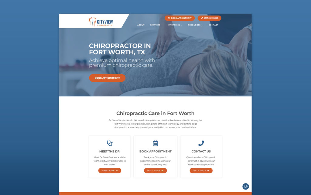
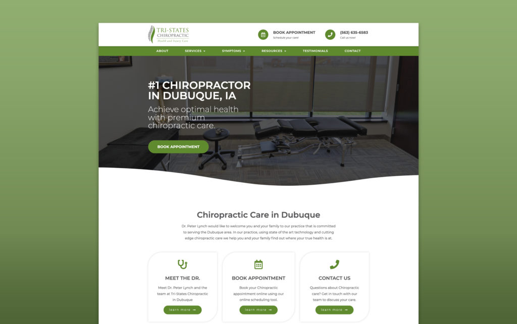
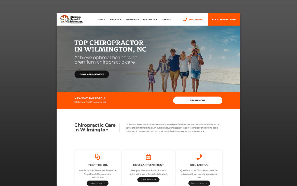
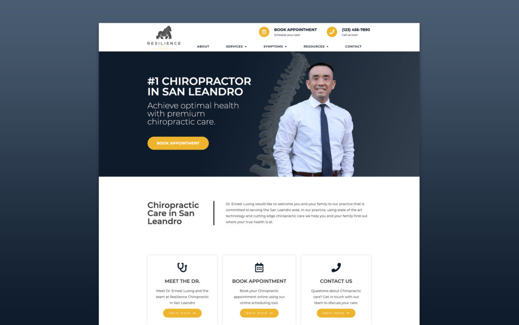

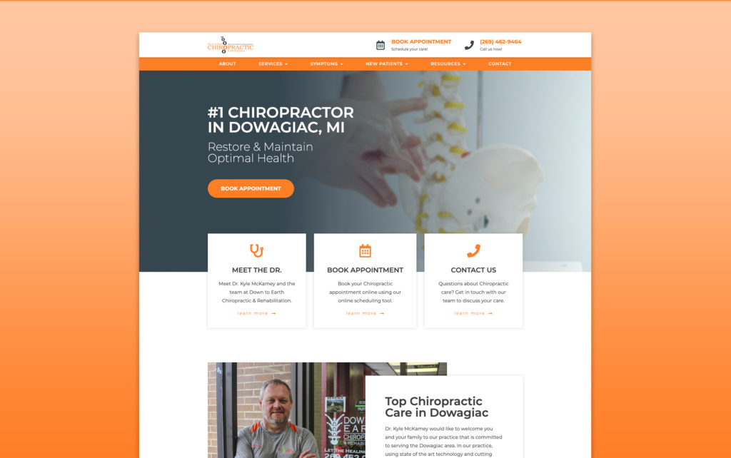
You want your website to be filled with high-quality, professional-looking photos that inspire trust in patients. Photos can set expectations for what patients will see in your office. Make sure they are clean and sharp!
Preferrable, use photos of you and your office. Hire a professional photographer to come through and do a photo shoot. The quality of the photos will be well worth it. Cell phones have good cameras, but nothing beats the skills of a professional photographer that understands angles and lighting to get the best shots.
When needed, you can fill gaps in your website photos with stock photography. This is a cost-effective option that can be used as an alternative to professional photography when you’re not able to get certain shots.
Once you have a visitor on your chiropractic website, your goal is to convert them into a patient. To do so, you need them to take the next step in booking their appointment. In the design of your website, you should be incorporating strong CTAs (calls-to-action) that give users the obvious next step they should be taking.
Here are some ways you can help convert more website visitors into patients:
In the navigation area, make sure to have your phone number listed and make it a link. That way when people click on it, it automatically initiates a phone call. Very useful in driving calls to your practice.
Some people don’t like picking up the phone and calling. And some people don’t like filling out forms. Adding a chat widget to your website is a great way to encourage visitors to get in touch with you. It’s not a “live” interaction, but because the visual interface is a chat window, the psychology here increases the conversion rates.
Throughout all pages and sections, you want to have large buttons that have high contrast colors to draw your eye. Those buttons should have strong verbs on them and links to push the user to the next step:
Instead of forcing a visitor to get in touch with you first, give them an option to just book right away. This reduces the friction and anxiety of having to talk to someone. Visitors can schedule on their own at their convenience, all hours of the day.
Some patients come to your site looking for certain information, but they are not yet ready to schedule an appointment. This is where a blog page comes in handy! Your chiropractic blog may be used to educate people on the benefits of chiropractic care. They will be more inclined to make their first appointment once they have better educated and equipped themselves on chiropractic topics.
Your blog articles can be super powerful for education. They also become super valuable pieces that you can distribute through your social media channels like Facebook. You can also distribute this to your email list to further nurture your relationship with your patients by educating them in their inboxes. This is super helpful in sparking reactivations for patients you haven’t seen in a while.
At the same time, your blog is also feeding new and fresh content to Google on a regular basis. This really helps build more authority with Google and other search engines, and that will lead to more organic traffic.
You want to write about the effectiveness of chiropractic for certain conditions, the benefits of your services, different steps in a patient’s journey towards wellness, tips and tricks they can focus on at home for their health, etc. You can even take it a step further and have guest bloggers publish content on your blog from time to time too! This introduces new voices and helps you widen your reach with fresh perspectives.
Some people don’t like to read, but they will consume video. Video content is the king of the internet these days. It’s easy to consume, it’s memorable, and you get to establish a more personal relationship by being the face and voice of your content.
Patient education videos can be intimidating to create without direction. Here are some tips to get you started:
We have all sorts of really great content on how to create killer chiropractic videos. Here’s a link to our Chiropractic Video Creation Guide.
SEO is a complicated topic that’s extremely important in building out your site. All the SEO-related items have a major impact on how your website will rank in search engines. Being able to show up in search engines is extremely important so patients can actually find you when they are searching for chiropractic care.
We’re not going to get into the technical weeds of SEO in this article, but here are some of the key items to consider when building your website.
By tackling these items, you’ll be in a better position to rank better on Google. That way when patients are already online looking for you, you show up at the top.
We wrote an SEO guide to optimize your Chiropractic website for search engine rankings. We dive deeper into all the aspects of SEO that you should care about to get the best rankings possible for your chiropractic practice.
But if you want a free audit of your website’s SEO performance, you can get a breakdown by going here.
Social media is a big component of having a strong digital presence. And linking your website together to your social media profiles is helping tie things together for your visitors as well as for Google.
Strong social signals help establish authority in Google’s eyes which increases your rankings. But also having active social profiles with engagement from your community builds trust with patients online.
You can simply link your social media profiles in the header/footer of your website. And on your social profiles, add your website link so patients can easily access your site from your profiles.
If you want to get fancy, you can even embed your social feeds into your website or even pull in patient reviews from your social channels.
Google Analytics is a free software that you can install into your website to track all the activity. You can see how many visitors hit your website, as well as stats like:
Tracking all the stats from your website can help you understand how your digital presence is performing. This insight can help you make game plans to grow your online traffic and patient leads from your site.
Building your own Chiropractic website is not the recommended method for building a website. There are a lot of intricacies involved in making sure everything is working and optimized correctly. The time you will invest trying to design, build, and maintain it at a high-performing level is probably better spent focused on running your practice and staying dialed into patient care.
However, if you decide you want to tackle this, there are many DIY website building tools out there like Squarespace, Wix, GoDaddy, and others. The benefit of using these builders is that it makes it easy to build the site yourself without a lot of technical knowledge. However, each DIY website building solution comes with its own set of limitations like design restrictions, clunky layouts, slow loading speeds, poor SEO, and more.
By building it yourself, you might save a little bit of money upfront, but you’ll lose those savings in time you’ll have to invest in all the tasks it takes to build it and maintain it.
The recommended approach is to work with a professional Chiropractic website company. You will probably pay more to work with a website design company, but you’ll save yourself endless hours of headaches trying to do it yourself and end up with a high-performing website that will help you excel online.
At CHIROBASIX, we make sure that all of our chiropractic websites are built following all the best practices for websites. We pride ourselves in making sure that your website is set up to help you dominate the online space. You’ll get:
If you’re looking for help in getting your chiropractic website built and optimized for your practice’s growth… we’re here for you.
Nick is the Founder of CHIROBASIX, a marketing agency that specializes in helping Chiropractors dominate their local markets and drive new patient acquisition.
Let’s connect and chat about how we can dominate your market.
Get growth tactics, interviews, and articles delivered right to your inbox.