
Chiropractic Logo and Branding: How to Build a Brand Patients Remember
Chiropractic logo and branding guide: logo types, spine clichés to skip, colors, fonts, naming, trademark basics, a brand kit checklist and choosing a designer.
Chiropractic branding is everything a patient uses to recognize and remember your practice: your name, logo, colors, fonts, voice, photos and the experience in your office. A good chiropractic logo is simple, readable at favicon size, works in one color, avoids spine and hands clichés, and looks identical everywhere your practice appears.

TL;DR (updated November 2026): Your brand is much more than a logo. It’s your name, logo, colors, fonts, voice, photos and office experience, all telling the same story. A good chiropractic logo is simple, original and readable at tiny sizes (a browser tab, a Google Maps listing, a social avatar), works in one color, and skips the spine, hands, stick figure and tree of life clichés. For most practices a combination mark (simple symbol plus name) is the safest pick. Before you fall in love with a name, check the USPTO trademark search, your state’s business registry and the domain. When the logo is done, get a full brand kit (vector files, transparent PNGs, color codes, fonts and usage rules) and use the exact same practice name everywhere, because Google and AI assistants rely on that consistency.
Most chiropractic logos look the same. A spine. A spine inside a circle. A spine that’s also a tree. Two hands holding a spine. A little stick figure stretching, maybe with a spine.
That’s not a knock on anyone. It’s what happens when the first idea goes straight onto the sign. The problem is that a patient comparing three chiropractors on their phone sees three spines and can’t tell you apart. And nobody remembers the third spine.
This guide is how we think about chiropractic branding when we build websites for chiropractors: what a brand really is, the logo clichés to skip, the logo types and which one fits a practice, colors, fonts, naming, trademark basics, how to pick and brief a designer, and the brand kit you need when it’s done.
What a Brand Really Is (It’s Not Just Your Logo)
A brand is what people recognize and remember about your practice. The logo is one piece. Here’s the full set:
| Brand piece | What it covers | Why it matters for a practice |
|---|---|---|
| Name | Your practice name, used exactly the same way everywhere | It’s how patients search for you and refer you |
| Logo | Your mark, in a few versions for different spaces | It’s the shortcut people remember |
| Colors | Two or three main colors plus neutrals | Makes your sign, site and shirts look like one practice |
| Typography | One or two fonts | Quietly sets the tone: modern, warm, clinical, premium |
| Voice | How you write and talk: plain, warm, funny, serious | Your website, texts and posts should sound like you |
| Photos | Real photos of your doctors, team and office | Proves you’re real and shows nervous patients what to expect |
| Office experience | The greeting, the décor, the music, how the first visit feels | The part patients actually tell friends about |
Here’s the part people skip: the office experience is the brand. A beautiful logo on the door of a practice where nobody says hello is a beautiful logo on a forgettable practice. The logo just makes a good experience easier to remember and refer.
If you only fix one thing on this list, make it photos. Real photos of you and your team do more for trust than any logo. It’s one reason we push real photography in every custom chiropractic website.
Chiropractic Logo Clichés to Avoid
The clichés aren’t wrong because they’re ugly. They’re wrong because they’re everyone’s first idea, so they can’t make you stand out, and most of them fall apart at small sizes.
| The cliché | Why it hurts you | What to do instead |
|---|---|---|
| A detailed spine | It’s the most common idea in the profession, and stacked vertebrae turn into a blurry squiggle at favicon size | Build the logo around your name, or reduce any spine idea to one simple, original shape |
| Hands holding or adjusting | Reads as generic “care” (it’s used for massage, nursing and senior care too) and gets muddy small | Show care through your photos, voice and office, not the mark |
| A stick figure stretching or jumping | Looks like clip art and is close to countless fitness and physical therapy logos | If movement is your thing, express it with a bold shape, a slanted letterform or energetic type |
| A tree of life or spine-as-tree | Common in wellness branding, and the fine branches disappear when shrunk | Use a simple leaf or organic shape only if “natural” really is your positioning |
| The caduceus (staff with snakes) | It’s a medical symbol, often confused with the Rod of Asclepius, and has nothing to do with chiropractic specifically | Leave medical symbols out |
| Stock or template icons | Other businesses can use the exact same icon, and you may not be able to protect it | Commission an original mark or go with a clean wordmark |
The quick test: cover the practice name. Could this logo belong to any chiropractor in America? If yes, it’s not doing its job.
That doesn’t mean a spine reference is banned. A clever, simple, original take can work. The point is to start from what makes your practice different (who you serve, how you work, your personality), not from the anatomy chart.
The 5 Logo Types (and Which Fits a Practice)
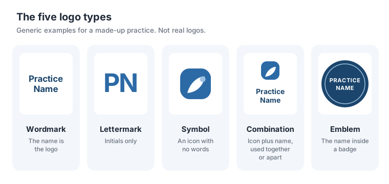
| Logo type | What it is | Pros for a practice | Cons for a practice |
|---|---|---|---|
| Wordmark | Your name in a distinctive typeface | Builds name recognition fast, which helps patients search for you; easy to keep original | Long names get small and hard to read; needs a separate icon for avatars and favicons |
| Lettermark | Initials only (like “PN”) | Compact and works small | Initials mean nothing to new patients until you’re well known; easy to confuse with other initials |
| Symbol or icon | A mark with no words | Great for favicons, avatars and apparel | A new practice has no recognition yet, so a symbol alone says nothing; this is where clichés creep in |
| Combination mark | Symbol plus name, usable together or apart | The most flexible: the full version for signs and the site, the icon alone for small spaces | Two pieces to design well; the icon still has to be simple |
| Emblem | The name inside a badge or seal | Looks established; great on apparel, stickers and window decals | Text inside a badge gets tiny fast; usually needs a simpler alternate version |
Our take: for most chiropractic practices, a combination mark is the safest choice. Patients see your name on your sign, website and Google listing, and the icon alone fills the small square spaces. If your practice name is short, a strong wordmark plus a simple icon or monogram for avatars is just as good, and it’s harder to get wrong.
Where Your Chiropractic Logo Has to Work
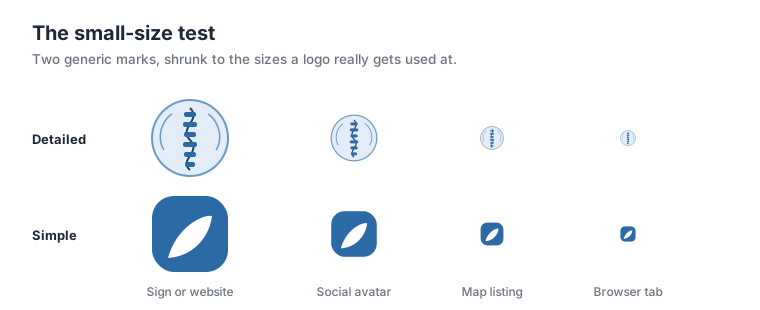
A logo that looks great on a designer’s big screen can fail everywhere patients actually see it. Before you approve anything, test it in every one of these places:
| Where it shows up | What it needs |
|---|---|
| Browser tab (favicon) | A square version that’s readable tiny. Google says a favicon must be square and at least 8x8 pixels, and recommends something larger than 48x48 so it looks good everywhere (Google Search Central). Your icon alone, not the full logo |
| Google Business Profile logo | A square-friendly version. Google’s photo guidelines call for JPG or PNG, 10 KB to 5 MB, at least 250 x 250 pixels, with 720 x 720 recommended (Google Business Profile Help) |
| Social media avatars | Usually cropped to a circle, so the icon has to sit comfortably inside one |
| Your website header | A horizontal version that’s readable on a phone without taking over the screen |
| Exterior sign | Readable from a car across the parking lot; thin lines and small taglines vanish at distance |
| Scrubs, polos and apparel | One or two colors (screen printing is usually priced by color, and embroidery loses fine detail) |
| Printed items | Business cards, care plan folders, intake forms and postcards, often in one color |
| Dark and light backgrounds | A white (reversed) version for dark photos, dark signs and dark shirts |
The two tests that catch most problems:
- The one-color test. Print the logo in solid black. If it stops making sense without its gradients, shadows or color, it’s not finished.
- The squint test. Shrink it to the size of a fingernail on your phone. If you can’t tell what it is, neither can a patient scrolling Google Maps.
Choosing Chiropractic Brand Colors
Color does a lot of work, but most of what you read online about color psychology is overstated. Here’s what’s solid and what’s just convention.
What the research supports: color shapes how people read a brand’s personality. A study in the Journal of the Academy of Marketing Science titled “Exciting red and competent blue: the importance of color in marketing” (Labrecque and Milne) linked colors to brand personality traits, including blue with competence and red with excitement. That’s a tendency, not a law: context, shade and your whole brand matter more than any single color.
What’s convention (not science): in healthcare, blues and greens are everywhere. They read as calm, clean and trustworthy, which is exactly why so many offices use them. The tradeoff is that you blend in with every other blue and green practice in town.
How to pick your palette:
- Start with the personality, not a favorite color. A family practice that’s warm and playful should look different from a sports performance clinic or a quiet, premium wellness studio.
- Look at the three or four practices closest to you. If they’re all blue, a well-chosen alternative helps a patient tell you apart.
- Pick one main color, one accent and neutrals. Most strong brands use far fewer colors than you’d think.
- Check contrast. Your colors have to be readable on a phone in sunlight and on a sign. Light gray text on white and yellow on white fail.
- Write down exact codes (HEX, RGB and CMYK) so your sign maker, printer and web designer all use the same color.
Fonts and Typography for a Chiropractic Brand
Typography quietly sets your tone. You don’t need to become a font expert, just get a few basics right:
- Use one or two fonts. One for headlines (this can have personality) and one for body text (this has to be easy to read).
- Readability beats style. Thin, ornate or script fonts look elegant on a big screen and fall apart on a phone or a sign. If you use a script font, keep it to the logo or short headlines.
- Match the personality. Rounded sans serifs feel friendly. Geometric sans serifs feel modern. Serifs feel established and premium. None is “right.” Pick what fits.
- Check the license. Make sure your fonts are licensed for your logo, website and print. Free web fonts like Google Fonts are a common choice for websites.
- Use the same fonts everywhere: website, signage, forms and social graphics. That consistency is what makes a small practice look established.
Naming Your Chiropractic Practice
If you’re starting fresh, the name matters more than the logo. You can redraw a logo. Changing a name means new signs, a new domain, new listings and patients who can’t find you.
What makes a good chiropractic business name:
- Easy to say, spell and remember. If you have to spell it out on every phone call, it’ll cost you referrals.
- Distinct from practices near you. “Family Chiropractic” plus your town name is probably taken, or close to something that is.
- Room to grow. Will it still fit if you add a second office, a massage therapist or a new service?
Two naming traps:
- Naming the practice after only your city. It’s hard to protect, easy to confuse with competitors, and awkward if you open a second location in the next town.
- Naming the practice only after yourself, if you might sell. “Dr. Smith Chiropractic” is great for a solo doctor who is the brand. But if you ever want to sell or bring in an associate who takes over, a buyer is paying for a name that walks out the door with you. If selling is part of the plan, use a brand name and feature yourself as the doctor.
Before you commit, check four things:
- The USPTO. Search the federal Trademark Search system for the name and close variations, especially in health and medical services.
- Your state’s business registry. Usually the Secretary of State’s office. It tells you whether the name is available to register as a business or a DBA in your state.
- The domain. Ideally the .com of your name, short and easy to type. Our chiropractic website checklist covers domain basics.
- Your state board’s rules. Some states have rules about how health practices name and advertise themselves. Check before you print anything.
Also search Google Maps for the name in your area. A practice with a nearly identical name 10 minutes away will create confusion forever, even if it’s legally fine.
Trademark Basics for Chiropractors
This isn’t legal advice, and a trademark attorney is worth the money if you’re investing seriously in a brand. But here’s what every owner should know, straight from the USPTO:
- A trademark can be any word, phrase, symbol, design or combination that identifies the source of your goods or services. Your practice name and logo can both qualify.
- You get some rights just by using the mark in business, but those rights are limited to the geographic area where you provide your services. Federal registration gives broader, nationwide rights.
- You can use “TM” or “SM” (for services) without filing anything. The ® symbol is only for marks that are federally registered, and only with the services listed in the registration.
- Similar isn’t safe. The USPTO’s likelihood of confusion test asks whether marks are “similar in sound, appearance, or meaning, or could create a similar commercial impression,” and whether the services are related. Changing one letter of an existing practice’s name won’t get you clear.
The DIY logo catch. Canva’s own help center says logos made from its templates can’t be registered as trademarks, because the templates are non-exclusive and anyone can use them (Canva Help Center). The same logic applies to stock icons from any library: if anyone can use it, you can’t own it.
The ownership catch. Whoever designs your logo, get it in writing that you own the final design and can use it anywhere. Freelance and agency agreements vary, and a logo you don’t own is a problem you find out about at the worst time.
How to Choose a Chiropractic Logo Designer
There’s no single right option. It depends on your budget, how much you care about owning a distinctive brand, and how much time you want to spend.
| Option | Best for | Pros | Cons |
|---|---|---|---|
| DIY tools and AI logo makers | A placeholder while you open, or a very tight budget | Fast, cheap or free, you’re in control | Template and stock elements can’t be protected; tends toward the same clichés; you have to know what “good” looks like |
| Freelance designer | Owners who want an original logo and can manage the project | Can be very good value; direct line to the person doing the work | Quality varies widely; you have to check portfolios, write a good brief and confirm file delivery and ownership |
| Design contest platforms | Owners who want to see many ideas quickly | Lots of concepts from different designers to react to | Many quick concepts rather than deep thinking about your practice; check how originality and ownership transfer work on that platform |
| Branding or marketing agency | Practices that want the logo, website, signage and listings to work as one system | Strategy plus execution; one team keeps everything consistent | Costs more than a freelancer; make sure you still receive and own all the files |
Prices change constantly, so check each platform’s current pricing page instead of trusting a number from an old blog post.
Whatever you choose, vet it the same way:
- Look at their portfolio for range. If every logo they’ve made looks the same, yours will too.
- Ask what you’ll receive. Use the brand kit checklist below as your list.
- Ask who owns the final design, and get the answer in writing.
- Ask about revisions: how many rounds, and what happens if none of the first concepts work.
If you’re also redoing your website, it’s worth reading chiropractic website templates vs custom design first. The same tradeoffs apply: a template gets you online fast, a custom build makes you look like you.
The Chiropractic Logo Design Process, Step by Step
A good logo project runs roughly like this, whoever does the design:
- Define the practice. Who you serve, what makes you different, three words for the feel you want (for example “warm, modern, family”), and the practices you compete with.
- Research. Look at competitors near you so you can avoid looking like them, and gather a handful of brands (from any industry) whose look you like.
- Sketch concepts. Several different directions, in black and white first, so the idea has to stand on its own without color.
- Narrow to one or two. Pick based on the brief, not on a favorite color.
- Test it in the real world. Favicon size, a Google Business Profile square, a social avatar circle, a sign mockup, a shirt, one color, white on dark. (See where your logo has to work.)
- Refine. Spacing, weight, small-size versions and the final color palette.
- Pick colors and fonts for the whole brand, not just the logo.
- Deliver the brand kit: every file, version, color code and usage rule.
- Roll it out everywhere at once: website, Google Business Profile, social profiles, signage, forms and apparel.
Step 5 is the one most practices skip, and it’s the one that catches the most problems.
How to Brief a Logo Designer
The quality of your logo depends heavily on the quality of your brief. A designer can’t read your mind. Answer these before the first call:
- What’s the exact practice name, and is there a tagline?
- Who are your ideal patients? (Families, athletes, prenatal, seniors, auto injury, desk workers?)
- What makes your practice different from the three closest chiropractors?
- What three words should people feel when they see your brand?
- What should it not feel like? (Clinical, cheesy, aggressive, “new age”?)
- Which local competitors do you want to look nothing like?
- Which brands, in any industry, do you admire visually, and why?
- Are there colors you love, or colors you won’t use?
- Where will the logo be used most? (Sign, scrubs, website, social, printed forms?)
- Do you plan to add locations, associates or new services, or to sell one day?
- Do you need it to work with an existing sign, building colors or décor?
- What’s your deadline (a grand opening, a sign order, a website launch)?
The best briefs are honest about what you don’t like. “No spines, no hands, nothing that looks like a hospital” saves a whole round of revisions.
Brand Kit Checklist: What to Get From Your Designer
When the logo is done, you need more than one JPG. Here’s the full kit:
Logo files
- SVG (vector, for your website and anything that scales)
- PDF or EPS (vector, for sign makers, embroiderers and printers)
- PNG with a transparent background (for documents, social graphics and anywhere a quick image is needed)
- Full-color, one-color black, and one-color white (reversed) versions of each
- Horizontal and stacked versions of the full logo
- A square icon version for favicons, social avatars and your Google Business Profile
Colors and fonts
- HEX codes (for the web)
- RGB values (for screens)
- CMYK values (for print), plus Pantone if your printer or sign maker needs it
- Font names, weights, where to get them and license details
Usage rules (a one or two page brand guide is enough)
- Clear space: how much empty room to leave around the logo
- Minimum size: the smallest the full logo should be used before switching to the icon
- Don’ts: no stretching, recoloring, adding effects or placing it on busy photos
- The exact practice name as it should be written everywhere
Ownership
- Written confirmation that you own the final design
- The editable source files, so another designer can work with them later
Store the whole kit in one shared folder your team, web designer and printer can all reach. It’s one of the first things we ask for when we start a website, and having it ready speeds everything up.
Rebranding an Existing Practice
Rebranding can be worth it, but it’s also expensive and disruptive. Don’t do it because you’re tired of looking at your logo. Your patients barely notice it.
When a rebrand is worth it:
- New ownership or a partner joins and the name no longer fits.
- A name conflict: another practice has a confusingly similar name, or you’ve received a trademark complaint.
- You’ve outgrown the name: a second location, a new service line, or a city name that no longer fits.
- The look is hurting trust: a dated or low-quality logo next to a modern, well-run practice.
- You’re repositioning: for example, moving from general care to a specialty focus.
When a refresh is enough: if the name is fine and the logo is just dated, a refresh (cleaner type, simpler icon, updated colors) keeps the recognition you’ve built and costs far less.
How to roll out a rebrand without losing patients or rankings:
- Update your Google Business Profile first: name (only if it legally changed), logo, cover photo and any photos showing old signs.
- Update your website: logo, colors, the practice name in page titles, footer, contact page and structured data. If the domain changes, set up permanent (301) redirects from every old page to its new page.
- Update every listing so your name, address and phone (NAP) match exactly: Facebook, Apple Business Connect, Bing Places, Yelp, Healthgrades and the directories you’re listed on. Our guide to Google Business Profiles for chiropractors covers the profile side in detail.
- Update physical items: exterior and interior signs, intake forms, business cards, care plan folders and apparel.
- Update social profiles: avatars, cover images, names and bios.
- Tell your patients. An email, a front desk mention and a sign in the office. “Same doctors, same great care, new look” heads off worry.
- Keep a “formerly known as” line on your website’s about page for a while if the name changed, so people searching the old name find you.
The most common rebrand mistake is doing it in pieces: new logo on the website, old logo on Google, old name on Yelp for two years. Plan it, then do it all at once.
Chiropractic Branding Mistakes to Avoid
- Starting with the logo instead of the practice. Decide who you serve and how you’re different first. The logo expresses that.
- Using the first idea. The first idea is usually the spine everyone else used.
- Too much detail. If it doesn’t work at favicon size and in one color, simplify.
- Too many colors and fonts. Two or three colors and two fonts look more professional than seven.
- A logo you don’t own. Template elements, stock icons or no ownership agreement can bite you later.
- Only getting a JPG. Without vector files, every sign and shirt order turns into a scramble.
- Inconsistent names. “Smith Chiropractic,” “Smith Chiropractic & Wellness” and “Smith Chiro” on three different sites confuse patients and search engines.
- Stock photos everywhere. A perfect logo next to stock photos of models still feels generic. Use real photos of your team and office.
- Ignoring the office. The experience in your office is the part of the brand patients talk about.
- Rebranding too often. Recognition takes years to build. Don’t throw it away every few years.
For examples of practices whose brand and website work together, see our roundup of the best chiropractic websites.
Branding, Local SEO and AI Search
Your brand isn’t just how you look. It’s also how search engines and AI assistants recognize you.
Use one name, exactly, everywhere. Google’s Business Profile guidelines say your name should reflect your real-world business name “as used consistently on your storefront, website, stationery, and as known to customers,” and that adding unnecessary information to the name isn’t permitted and can lead to a suspension (Google Business Profile Help). So don’t stuff “Best Chiropractor Denver” into your profile name. Make the name on your sign, website and listings match.
Keep your NAP identical. The same practice name, address and phone number on your website, Google, Facebook, Apple, Bing and directories. When everything matches, Google and AI assistants can confidently connect every mention, review and listing to one practice. When it doesn’t, you split your own credibility.
Make your name memorable enough to search for. A distinctive name means people who hear about you from a friend can find you in one search, instead of getting a list of five similar names. That’s branding paying off in search.
Let your brand show up in your content. AI assistants like ChatGPT and Google’s AI Overviews pull from what’s public about your practice: your website, your reviews, your listings. A clear, consistent voice and the same facts everywhere make you easier to recommend. Learn more in our guide to AEO and GEO for chiropractors.
Your website is where all of this comes together: your logo, colors, fonts, photos and voice in one place, with the same name and NAP as your listings. Our complete guide to website design for chiropractors covers how design, SEO and conversion fit together.
Chiropractic Logo and Branding FAQs
What makes a good chiropractic logo? A good chiropractic logo is simple, distinctive and readable at tiny sizes like a browser tab or a Google Maps listing. It works in one color, matches the kind of practice you run, and skips the spine, hands and stick-figure clichés that make most chiropractic logos look alike.
Should a chiropractic logo include a spine? Usually not. A spine is the first idea almost every chiropractor has, so it makes you look like everyone else, and detailed vertebrae turn to mush at small sizes. If you love the idea, have a designer reduce it to a simple, original shape that still reads at favicon size.
What colors are best for a chiropractic logo? There’s no single best color. Blues and greens are the convention in healthcare, which reads as safe but can blend in. Pick colors that fit your practice’s personality, stand out from the offices near you, and have enough contrast to read on a phone and a sign.
What type of logo is best for a chiropractor? For most practices, a combination mark works best: a simple symbol plus the practice name. You get the name for recognition and the symbol alone for small spaces like social avatars and favicons. A clean wordmark is a strong choice if your name is short.
Can I make my chiropractic logo in Canva? You can, but Canva says logos built from its templates can’t be registered as trademarks because the templates are non-exclusive. If you want to own and protect your logo, design it from scratch or hire a designer, and keep the original files.
How do I name my chiropractic practice? Pick a name that’s easy to say, spell and remember, and that isn’t too close to another practice nearby. Avoid naming it after only your city or only yourself if you might expand or sell. Check the USPTO, your state’s business registry and domain availability before you commit.
Do I need to trademark my chiropractic practice name? You get some rights just by using a name in business, but the USPTO says those rights are limited to the area where you operate. Federal registration gives broader, nationwide rights. If you plan to grow or sell, talk to a trademark attorney before you invest in signage.
What files should I get from my logo designer? Get vector files (SVG plus PDF or EPS), PNGs with transparent backgrounds, full-color, one-color black and white-reversed versions, a square icon version, your exact color codes in HEX, RGB and CMYK, the font names, and written confirmation that you own the design.
When should a chiropractic practice rebrand? Rebrand when the old brand is causing a real problem: a new owner or partner, a name conflict, an expansion beyond the old name, or a look so dated it hurts trust. Don’t rebrand just because you’re bored of the logo. Your patients aren’t.
Does branding affect local SEO for chiropractors? Yes. Google asks that your Business Profile name match the name you use on your storefront, website and stationery. The same name, address and phone everywhere help Google and AI assistants connect every mention of your practice to one business.
Want your brand and website to work as one? CHIROBASIX builds chiropractic websites around your real brand: your logo, colors, photos and voice, with the same name and NAP everywhere Google and AI assistants look. See our website program or book a free call to talk it through.
Keep reading
Chiropractic Review Request Templates: 30+ Texts, Emails and Scripts
A copy-paste library of chiropractic review request templates: in-office scripts, texts, reminders, emails, QR card copy, Spanish versions, and a what-not-to-say table.

How to Grow a Chiropractic Practice: 29 Proven Ideas (2026)
Growing a chiropractic practice takes more than marketing. Here are 29 ideas across every growth lever, from the phone and the report of findings to retention, team, KPIs and a second location.

How to Save Michael Scott Chiropractic
Michael Scott traded paper for adjusting tables. Everyone adores him, nobody refers, and Stanley hasn't been back since March. The CHIROBASIX team has concerns, and six strategies.
Want this kind of strategy built for your practice?
Book a free consultation. We'll audit your current marketing and map out the omnipresence plan for your local market.
Book A Free Consultation